Brand
Hoxger's logo, colours and typefaces, with the rules for using them. Download the files for an article, a presentation or partner materials.


Logo
The logo is a mark and a wordmark. Use the ready-made files, always in one colour: Earth on light backgrounds, Cloud on dark ones and on paintings.
- The clear space around the logo is the height of the letter x.
- The full logo is at least 96 px wide.
- On a painting, place the logo on a calm patch of sky.
Construction
- Mark height
- 1.22 × h
- Mark to wordmark
- 0.42 × x
- Clear space
- 1 × x
- Minimum width
- 96 px


What not to do
The logo's proportions are set to the unit. If it doesn't fit a space, change the layout around it.
- Don't stretch it
- Don't rotate it
- Don't mix colours
- Don't add shadows or effects
- Don't retype the name
- Don't place it on a busy area


Colours
Cloud is the main background and Earth the text colour. Blue is the accent: two elements per page at most.
Text needs a contrast of at least 4.5:1 with its background. Pewter is for graphics only; on Cloud it's too light for text.
Download CSS variables| Name | HEX | OKLCH | Use |
|---|---|---|---|
| cloud | #EEEDEA | oklch(94.5% 0.004 85) | Main background, light logo |
| mist | #C9C7C3 | oklch(83.0% 0.006 85) | Dividers and secondary surfaces |
| pewter | #979591 | oklch(67.0% 0.006 85) | Supporting graphics |
| blue | #32657B | oklch(48.0% 0.065 228) | Links, buttons and accents |
| slate | #5C5B57 | oklch(47.0% 0.006 85) | Labels and secondary text |
| earth | #1A1815 | oklch(21.0% 0.006 85) | Main text, dark background and logo |
- cloudMain background, light logo
- mistDividers and secondary surfaces
- pewterSupporting graphics
- blueLinks, buttons and accents
- slateLabels and secondary text
- earthMain text, dark background and logo


Typography
Titles and slogans are set in PT Serif; body text, labels and numbers in Schibsted Grotesk.
Refined in every detail.
Titles and slogans. Regular weight.
Refined in every detail.
Body text, labels and numbers. Regular and Medium.
Scale
| Role | Typeface | Size | Line height | Tracking |
|---|---|---|---|---|
| Display | PT Serif | 96 px | 0.97 | -2.5% |
| H1 | PT Serif | 64 px | 1.00 | -2.5% |
| H2 | PT Serif | 40 px | 1.05 | -2% |
| H3 | PT Serif | 24 px | 1.20 | -1% |
| Large text | Schibsted Grotesk | 19 px | 1.55 | 0% |
| Text | Schibsted Grotesk | 16 px | 1.55 | 0% |
| Caption | Schibsted Grotesk | 13 px | 1.40 | 0% |


Images
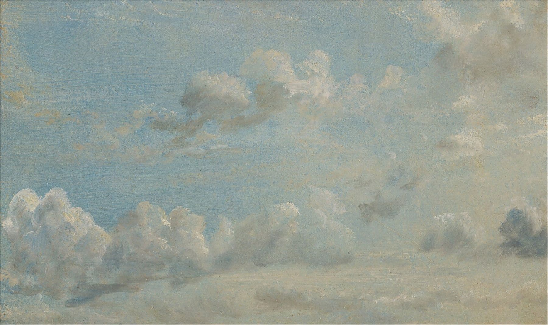
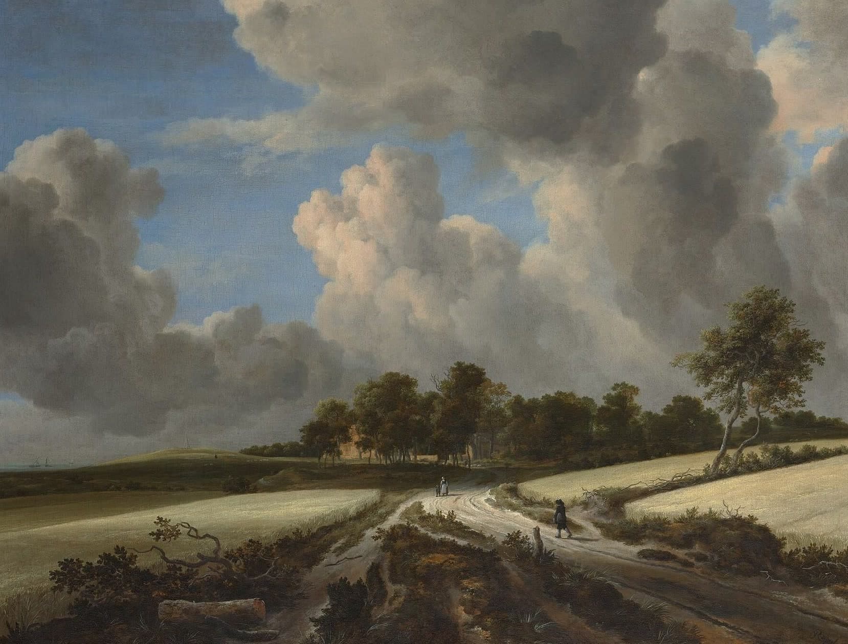
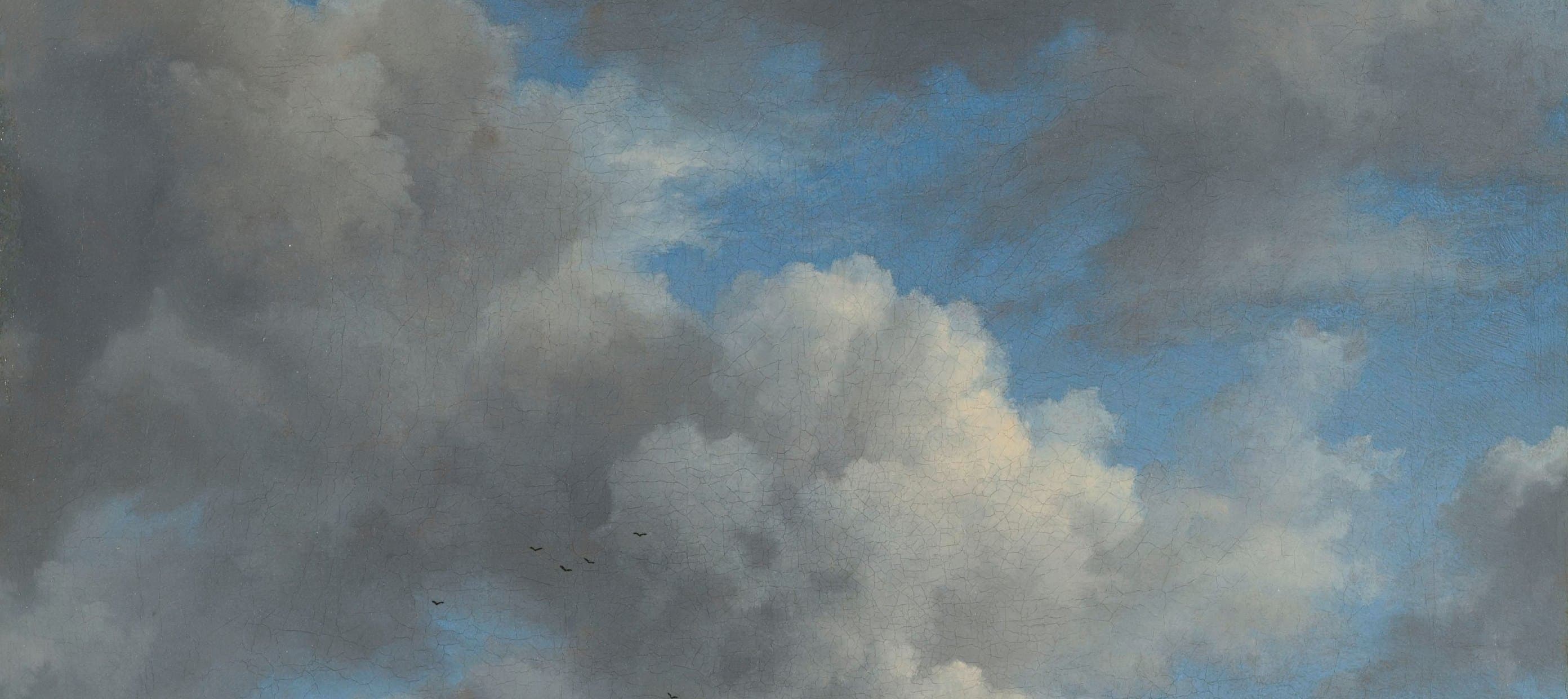
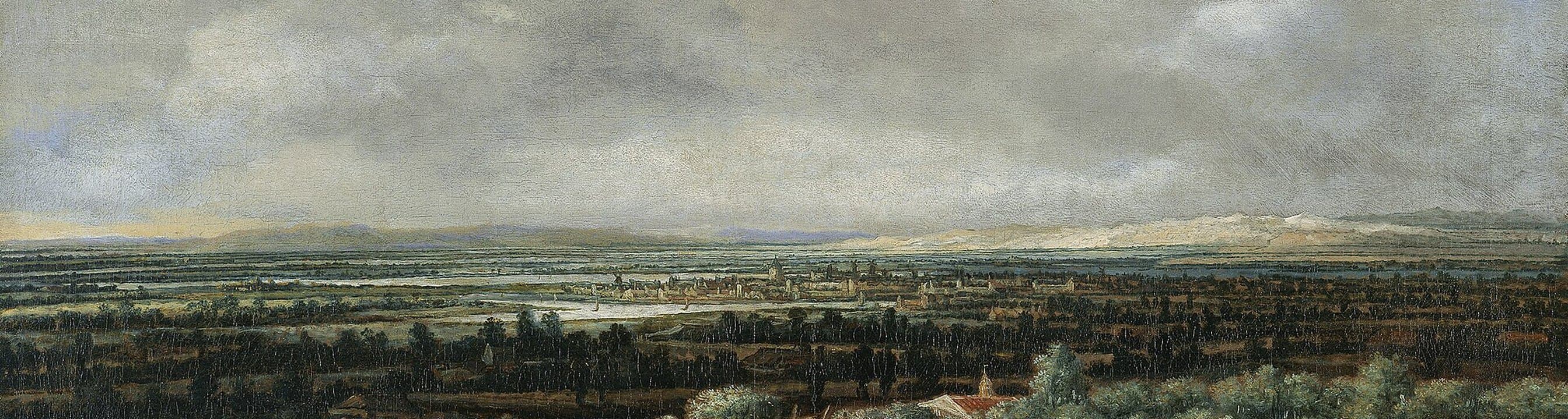
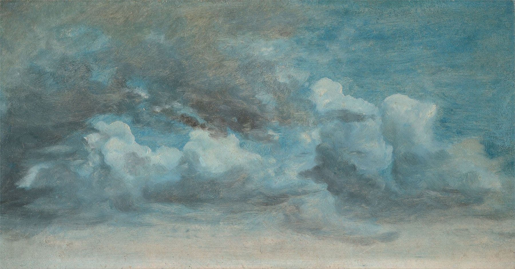
We use landscapes by 17th-century Dutch masters and 19th-century cloud studies, all in the public domain.
- The sky fills at least 60% of the frame. Clouds are light, with no storms or sunsets.
- The painting stays as it hangs in the museum: no filters, no frames. We don't use AI-generated images.
- Text sits on calm sky, over a dark veil at 32% opacity, or 40% on a bright sky.














Voice
We address the client as “you” and ourselves as “we”. We say what we do and give concrete results, without industry jargon.
We build web applications and run the servers they live on.
Every change is checked automatically before your customers see it.
Need another format, or want to use the logo in an unusual way?Write to us